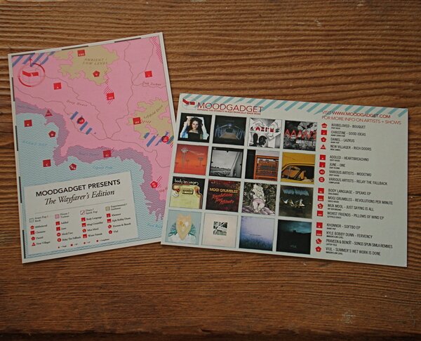
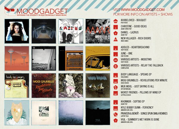
The images above are from a design created for the 1st half of 2009's releases on Moodgadget, originally conceived as a promotional flyer, it will also see limited run as an 11x17" print. Photographs of the design in both forms will be forthcoming.
In the very beginning, we planned to iterate the design for the second catalog flyer of the "Edition Series" with a treatment very similar to that of its precursor, The Yellow Edition. Original ideas included blues or greens, and patterns such as ferns and plants, or that of a shemagh or keffiyeh.
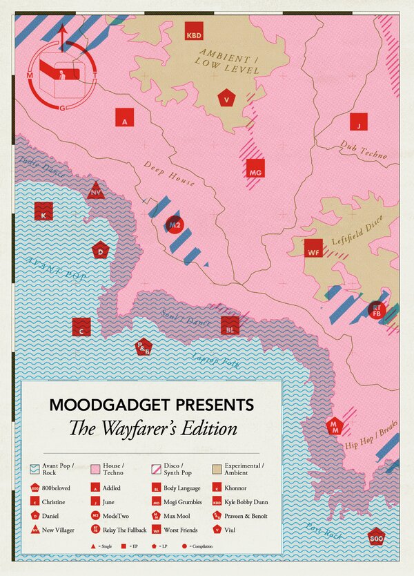
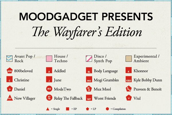
When none of these ideas materialized, I decided to move in a new direction, wanting to incorporate an infographic element to the design, while maintaining a warm, classical, almost schoolbook look and feel. While a map wasn't quite the first idea, it certainly began to materialize quickly-- the elements of a map seemed naturally appropriate for visualizing the diverse and eclectic mix of sounds. The result is designed to be intuitive and easy to interpret. Moodgadget art director Adam E. Hunt, who insisted the design go the extra mile for interpretability, remarked that the final form "looks awesome, and is very functional."
Flyers in today's world are only ever effective if they catch the eye, but meet the viewer with clear and easily digestible information. This flyer is intended for viewers to spend a few moments "playing with" visually, while being able to interpret that if they've never heard, say, Worst Friends, they will know they play leftfield disco, and that means a sort of mix between disco, techno, and ambient sounds.
